
Table of Contents
- Why Graphic Tee Trends Matter in 2026
- Graphic T-Shirt Design Trends 2026: The 7 Looks Leading the Year
- Typography, Illustration, and Color: The Design Details That Decide a Tee
- Vintage Graphic Tees: Why Worn-In Still Wins
- Oversized Graphic Tees: Fit, Fabric, and Construction
- Graphic Tee Outfit Ideas for Real Occasions
- How to Tell a Lasting Trend From a Microtrend
- Conclusion
- Frequently Asked Questions
Last Updated: October 18, 2026
Why Graphic Tee Trends Matter in 2026
Graphic tee trends in 2026 reward the people who treat a T-shirt like a decision, not an afterthought.
At Bargainoutlet.store, we sell graphic tees, hoodies, and activewear, so we spend a lot of time looking at what people actually reach for.
Below, we break down the seven looks leading 2026, plus the fit, fabric, and styling details that separate a keeper from a novelty.
Graphic T-Shirt Design Trends 2026: The 7 Looks Leading the Year
The seven looks leading graphic T-shirt design trends in 2026 are slogan and text-based designs, band and music graphics, nostalgic and retro prints, illustration-led artwork, typography treatments, bold color stories, and faded pastel palettes. Each one works differently on the body, and each has a different shelf life.
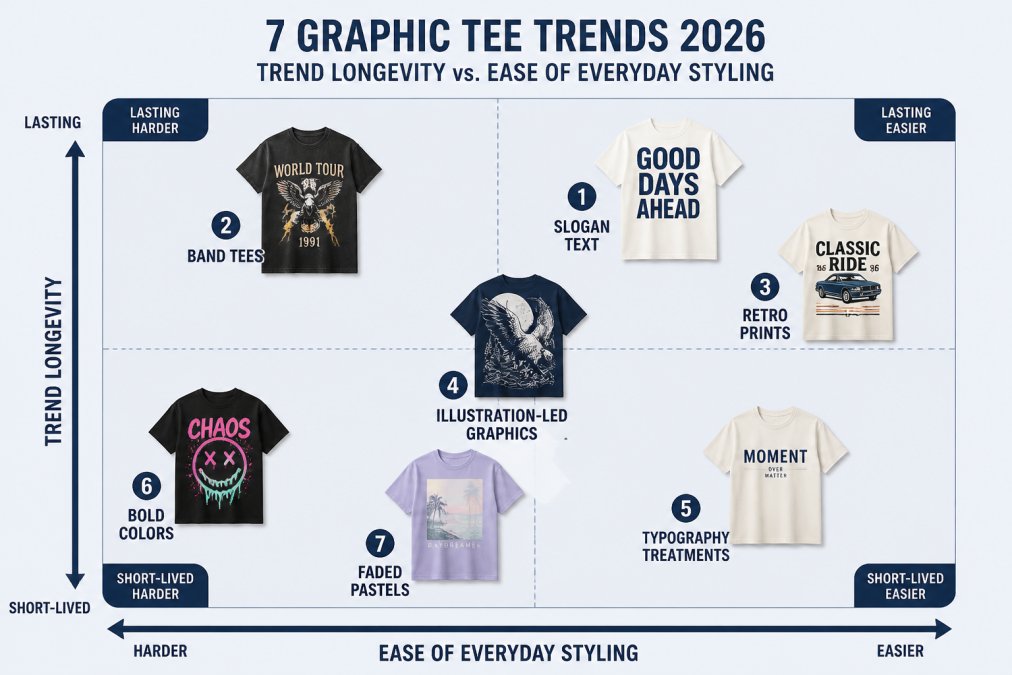
Slogan and Text-Based Designs
Slogan shirts are the fastest-moving category of the year, and the reason is simple: text reads at a distance. A single line in bold type does the work a whole illustration used to do.
What most guides miss is that the words matter less than the lettering. A short phrase in a clean sans-serif holds up across sizes. A long sentence in a thin font turns to mush the moment it stretches across a chest.
Band and Music Graphics
Band tees have moved from concert style into everyday basics. The 2026 version is not a replica of a tour shirt from decades past; it is a cleaner print, often a single logo or album mark, on a heavier blank.
A common mistake is buying a band tee purely for the artwork and ignoring the blank. If the fabric is thin, the print will crack along the shoulder seams within a few washes.
Nostalgic and Retro Designs
Retro graphics keep pulling from the same well: faded pastels, sunset gradients, and type styles borrowed from old advertising. The look works because it reads as familiar without being a costume.
Our rule of thumb: one nostalgic element per shirt. A retro font plus a retro palette plus a retro illustration tips into theme-party territory.
Typography, Illustration, and Color: The Design Details That Decide a Tee
Typography and color decide whether a graphic T-shirt looks considered or chaotic. Handwritten fonts, repeating text, and minimalist text are all having a moment, and so are doodle graphics, celestial designs, and free-flowing lines. The detail that separates them is restraint, and the way each choice interacts with the body wearing it.
Typography: Match the Lettering to the Print Size
- Handwritten fonts work best small, as a chest hit or a pocket print. Scale them up and the strokes thin out, so the print reads as a smudge from a few feet away.
- Repeating text needs tight spacing and a consistent baseline or it reads as noise. A common pattern is to keep the repeat to one line and let the negative space do the work.
- Minimalist text lives or dies on kerning. Wide-tracked capitals in a heavy weight hold their shape across sizes; condensed thin type stretches and distorts when printed on a curved chest.
- Eye-catching graphics in intense colors should sit alone, with no competing print on the back. Two focal points split attention and make the shirt look busier than it is.
A practical test: photograph the shirt from three feet away. If you cannot read the words or parse the illustration at that distance, the type is too fine or the graphic is too dense for everyday wear.
Illustration-Led Graphics: Line Weight and Placement
Doodle graphics and free-flowing line work succeed when the line weight is consistent. A mix of hairline and heavy strokes looks intentional on a poster but muddy on jersey cotton, because the fabric texture breaks up thin lines.
Placement matters as much as the artwork. A graphic centered on the chest draws the eye to the widest part of the torso; a graphic placed higher, near the collarbone, lifts the gaze.
Color: Build a Palette Around the Blank
Color follows the same logic. Muted brights and faded pastels photograph well and pair with denim; intense colors need a plain bottom half to avoid a clash.
A useful rule is to count the colors in the print. Two or three tones stay versatile; five or more narrow the shirt to a specific outfit. If you want one tee to work across a week of outfits, favor prints that pick up a color already in your closet.
Inclusive Styling: The Same Print on Different Bodies
Most trend guides show one body type and one gender expression. The more useful question is how a print adapts. A large chest graphic can be balanced with a open overshirt or a longer hem; a smaller frame can carry a bigger print if the shirt is sized so the graphic sits on the torso rather than wrapping the side seam.
Vintage Graphic Tees: Why Worn-In Still Wins
Vintage graphic tees win because a worn-in wash hides the two things buyers fear most: a print that looks too new and a fit that looks too stiff.
The catch is that "vintage" describes a look, not an age. You can get the effect from a garment-dyed or washed cotton blank without hunting for a decades-old original.
If you are coming from fast-fashion tees, expect the difference to show up around wash five, not wash one.
Oversized Graphic Tees: Fit, Fabric, and Construction
Oversized graphic tees live or die on three measurements: shoulder drop, body length, and sleeve width. Get those right and the shirt drapes; get them wrong and it swallows you.
Fabric matters just as much. A heavier cotton holds a boxy shape and keeps a large print from stretching out of proportion. A lighter jersey clings and curls at the hem.
Graphic Tee Outfit Ideas for Real Occasions
Graphic tee outfit ideas work best when you build around the shirt instead of competing with it. The formula is one loud piece, one neutral, one texture, and the neutral should sit next to the print, not across the room from it.
| Occasion | Pair With | Avoid |
|---|---|---|
| Casual weekend | Straight-leg jeans, canvas sneakers | Second printed piece |
| Dinner out | Dark trousers, a blazer, leather sneakers | Gym shorts |
| Office (relaxed) | Chinos, a knit cardigan, loafers | Oversized boxy fit |
| Concert or game | Denim jacket, boots | Anything you'd mourn if spilled on |
| Errands | Joggers, a zip hoodie | Stiff new denim |
For a subtler look, tuck the front hem and add a belt. For a streetwear read, size up once and keep the bottom half plain. Summer fashion leans toward lighter washes; spring fashion handles the same shirt under an open overshirt.
Outfit Formulas by Body Type and Expression
The same shirt reads differently depending on how it sits on the frame. A few formulas that travel well:
- Long torso: a front tuck with a mid-rise bottom keeps the graphic from sliding below the waistband. A cropped jacket adds a horizontal line where you want it.
- Short torso: leave the hem untucked and choose a slightly shorter body length so the print sits on the chest rather than the stomach.
- Broad shoulders: a raglan or drop-shoulder cut softens the line; a set-in sleeve with a tight collar emphasizes it.
- Curvier frame: a heavier cotton holds its shape and keeps the print from stretching across the chest; a lighter jersey will pull and distort the graphic over time.
- Gender-expansive styling: the same print can be worn fitted, oversized, tucked, or layered. The lever is silhouette, not the graphic, a boxy cut and a straight leg read one way, a fitted cut and a wide leg read another.
Care and Maintenance: Make the Print Last
Most print fading comes from heat and friction, not from the graphic itself. Turn the shirt inside out before washing, use cold water, and skip the dryer or use the lowest heat setting.
Store printed tees folded rather than on a hanger if the print is thick; hanger shoulders stretch the neckline and pull the graphic off-center. If a print does start to crack, an iron on the reverse side with a pressing cloth can soften the edges, but it will not restore the ink.
How to Tell a Lasting Trend From a Microtrend
A lasting trend survives a change of context; a microtrend only works in the exact styling you first saw it in. That is the whole test.
Ask three questions before you buy:
- Can you style it three ways? If it only works with one outfit, it is a microtrend.
- Does it read without a caption? Prints that need explaining age fast.
- Would it look fine in a photo from two years ago? If not, it will look dated in two years.
Slogan text and retro washes pass this test. A hyper-specific meme print usually does not.
Conclusion
The hard part of graphic tee trends is not spotting them; it is picking the ones you will still want to wear next year. Start with fit and fabric, then let the print follow.
That is where we come in. Bargainoutlet.store is veteran-owned, our apparel is made in the USA, and every order carries a 30-day satisfaction guarantee with free shipping over $50.
Frequently Asked Questions
Are graphic tees in style in 2026?
Yes. Graphic tees are a core piece of streetwear and everyday dressing in 2026, and the category has widened rather than faded. Slogan and text-based designs, band graphics, and retro-inspired prints all show up across casual outfits. The shift is toward prints that feel intentional: a clean typeface, a single strong illustration, or a washed vintage finish instead of a busy all-over design. That makes a graphic tee easier to wear now than in past cycles, because it works with jeans, chinos, and layered jackets alike.
How do you style a graphic tee in 2026?
Start with fit. A fitted tee pairs well with wide-leg or relaxed trousers, while an oversized graphic tee balances better against slim or straight-leg bottoms. Tuck the front hem slightly to define the waist, or leave it loose for a casual look. Layer a button-down shirt or light jacket over the tee so the print shows at the chest. Keep the rest of the outfit simple: one print, neutral bottoms, and shoes that match the formality of the setting. Graphic tee outfit ideas work best when the shirt is the only loud element.
Are vintage graphic tees still popular?
They are. Vintage graphic tees remain one of the most durable looks in the category because the faded print and softened cotton read as authentic rather than trendy. You do not need an actual decades-old shirt to get the effect. Modern tees with washed finishes, cracked-print effects, and muted retro palettes deliver the same look with better construction. Check the print method and fabric weight before buying, since a thin shirt with a stiff print will not age the way a real vintage piece does.
What should I check before buying an oversized graphic tee?
Look at three things: fabric weight, shoulder seam placement, and print method. A heavier cotton holds its shape and drapes instead of clinging. Dropped shoulder seams signal a true oversized cut rather than a shirt that is simply one size too big. For the print, screen printing tends to last longer than heat-transfer graphics, which can crack after repeated washing. Wash the tee inside out in cold water and skip the dryer to keep both the fit and the graphic intact.
Sources and further reading: American Apparel & Footwear Association industry resources, Cotton Incorporated fabric and care guidance, Federal Trade Commission guidance on textile labeling.